Redesigned | The Updated Bathroom
A beautiful, updated bathroom is on many a homeowner's wish list - and for good reason, too. Because although it may be a small space, an updated bathroom with a super clean, streamlined design can give the entire home a huge lift. Small space can still mean big impact if the design is right, and we are here for allll that strategic goodness. So today, we’re going all-in on the blog with more of the big reveal from a recent home renovation, which also included transforming three bathroom spaces (If you haven’t already, catch up on the kitchen design here!).
The Great Bathroom Update
For this home design, we fully redesigned and renovated a powder room and two full bathrooms- a full bathroom update for the entire house. And, it was done in tandem with a full kitchen renovation. Creating flow between these high-function spaces and generating a design vision in alignment with the overall aesthetic was a key piece in curating a visual flow that made sense from room to room. One thing we (and our clients) love about true custom design is that the design can visually take shape in any way that serves them best. They don’t have to ascribe to any particular look or style, but rather we, as a team, choose to focus on what makes that client’s home look and feel the best for THEM. It’s a liberating thing to be able to create spaces that serve our clients and their families in so many different ways. And for this home, it was all about clean lines, fresh surfaces paired with warm tones, and subtle but strong infusions of color.
Vanity Goals
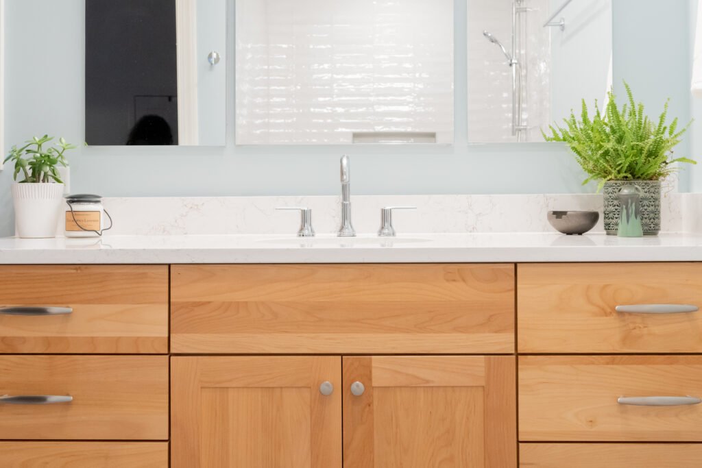
Speaking of warm tones, let’s dive right in on the vanity. If you remember looking around the kitchen we created for this space, you know that one of the foundations of this Master Design Plan was bringing in organic elements, including gorgeous full-custom cabinetry. A light but warm-toned look with an incredibly beautiful wood grain brought an inviting feel to the space and provided balanced depth to the surrounding light and airy elements. We created design continuity and visual flow by carrying this over into the bathroom spaces with a custom vanity. We love how this warm tone pops against the super clean, white quartz and streamlined tile (but more on that below!). And, we also can’t help but give some love to the cool-toned and sleek hardware that provides that pop of visual tension against the natural wood grain.
Connecting the Color Story
When we’re working within a smaller footprint (which is usually the case with an updated bathroom renovation), getting strategic with color and contrast is even more important. Infusing color and tone in just the right way is going to keep the space visually interesting, without being overwhelming or making the space feel smaller. The color story in each of these bathrooms also gives a subtle tie to the blue tones we layered into the kitchen design. A lighter blue wall hue for the master and hall baths and a deeper, moodier tone for the powder room kept the spaces unique but connected. We also kept visual flow with the kitchen design by bringing that beautiful custom cabinetry into all the bathrooms, sharing the same gorgeous wood grain and echoing the organic elements throughout the multi-room design. With that contrast of warm wood as a base, the lighter stone countertops and clean, crisp custom tile work were set to do an even better job of opening up that space and reflecting so much light throughout the room. You can take a peek at some of the tile work pictured in the hall bathroom shower and the master bath below:
Perfect Follow-Through
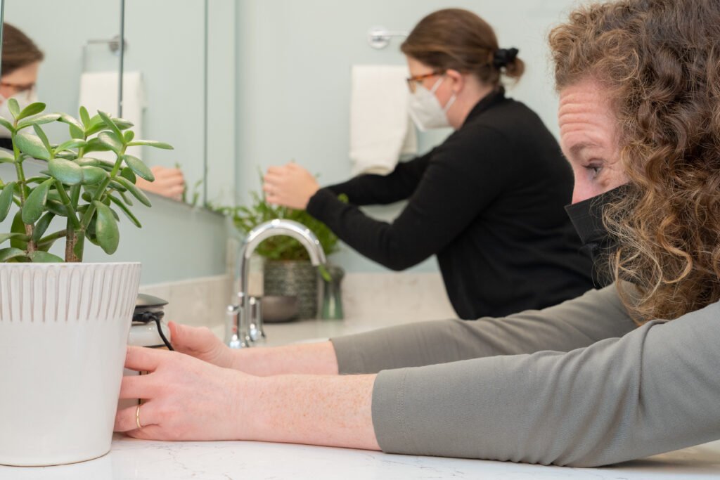
And those finishing touches? Y'all know we’re here for that, too- because a fully updated bathroom needs those perfect details to feel complete, just like any other space. If you’ve been following for a little while, you know that we take an all-hands-on-deck approach, from the first day of design vision in the studio all the way to placing each final item in the home ourselves. It would be easy to outsource the heavy lifting and finishing, but following through and making sure that things are done right is one of our favorite parts of the job. Making these bathrooms felt beautiful, inviting, and finished in every way matters to us- from putting up the shower curtain to hanging towels with the perfect fold and beyond.
A Complete (Bathroom) Update
Especially when it comes to multi-room and full-home designs, we’re always thinking about the line of sight- how your eye moves from one area to the next. This aspect of design matters when it comes to continuity and visual congruence: it's about what meets your gaze while you're moving through the rooms of the house, and how it all connects. It always adds a little bit of fun strategic challenge when we are visually connecting rooms that may not be right next to each other, like in this design. In the kitchen renovation, those deep blue tones in the flooring and countertops anchor the space, echoing water and stone elements. And for the small powder room here, we loved tying in a rich mixture of blue and slate. It gave just a little bit of depth and drama to the design flow, and reinforced that feeling of continuity throughout the house. This view from the hall as you approach is one of our favorites from this project - drawing each of these spaces together to completion.
Updated bathrooms are so much fun to design, but that's far from all we do! If you'd like to see more current projects, check out more of the CFD blog here, or take a tour around our Portfolio Page. Have a design dream of your own? We're here to help- reach out to us anytime at hello@catfrenchdesign.com or via our Contact Page. For more in-the-moment happenings of our busy team, follow us on Facebook or catch up with us on Instagram @catfrenchdesign.


